You may or may not be aware of a recent change this month from the mighty Google. A change that really will see you loose your position in SERPS (Search Engine Results Page) if you don’t move with the times. The change is the priority placement of mobile and responsive ready websites over those who are not. If your website is not optimised or mobile friendly, then any searches carried out for your business or keywords (services / products) you are trying to get traffic from on a mobile device, then you will be loosing out over those who are mobile friendly.
We cannot say we did not see this coming, as even more searches carried out today than ever are being carried out on mobile devices. The smartphone has completely found its place in todays mobile savvy society along with the rise in use of tablets too. Lets face it, just how easy is it to search out that restuarant, next holiday or high street bargain from your mobile?
Rather than then not place your order or use the mobile to complete the transaction, Google wants website owners to make the experience even better so you can complete your transaction or place your business with your mobile. Yes Desktop still has its place and sure, some would rather complete their holiday booking are large scale purchase on a desktop, but the starting point today is on a tablet or mobile.
So how do I go mobile with my website?
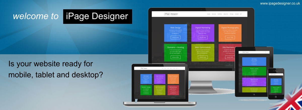
You need to consider either a site rebuild, a mobile site that runs along your main site or perhaps a responsive theme next time you update. A responsive theme is simply your main desktop site, that changes shape to fit a tablet or mobile and optimises the experience for the smaller screens. It also adapts and changes when viewed in either portrait or landscape positions too.
Images can still be seen, text read clearly and the site navigation is as easy to use as on a desktop.
How much will a mobile / responsive website cost me?
It can vary on many factors, from the size of your current site and what it is currently used for. If you wanted just a single 1 page website that really does work for mobile, tablet and desktop then we ourselves can provide you with a finished article from as little as £159. View our responsive single webpage demo site here.
If you need to say a little more, then a typical new 4-5 page website from as little as £259 can be setup for you. View our responsive basic website demo site here.
If however, you still want a site you control, a content managed solution, then we will always recommend the use of WordPress and our expertise to built you a demo site like this. View our WordPress Responsive Demo site here.